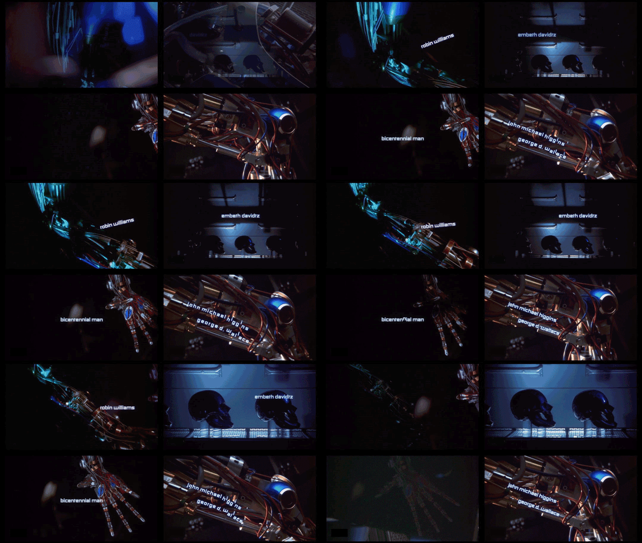
Example of credits:
Which credits do we see & the order we see them in?
First we see 'Touchstone Pictures" with it's logo followed by "Columbia Pictures" and "Touchstone Pictures" once again this time without a logo and in a uniform font. Then we see "A 1492 production" in a clean font without any logos or colours followed by other producers, "Laurence Mark Productions" and "Radiant Productions" both in the same font. Then we see the director, "Chris Columbus", followed by the main actor 'Robin Williams' followed by the name of the film, 'Bicentennial Man'. Then there is a number of actors staring in the film followed by "Casting by Janet Hirshenson and Jane Jenkins", then "Music composed and conducted by James Horner", "Costume Designer Joseph G. Aulisi", "Edited by Neil Travis", "Production Designer Norman Renolds", "Director of Photography Phil Meheuh", "Executive Producer Dan Kolsrud", "Produced by Wolfgang Petersen, Gail Katz, Neal Miller and Laurence Mark and Laurence Mark", "Produced by Chris Columbus, Mark Radcliffe, Michael Barnathan", the 'Based upon', 'Screenplay' and finally the director again.
What font type is used for the titles?
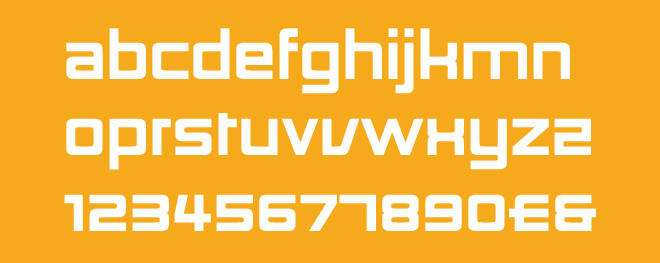
The font for type used for the opening sequence is 'Architype Ballmer' and 'Architype Gridnik'. Here are examples of the fonts below:
How we see the font - where do we see it in the frame?
All text in the opening sequence sticks to either the left or right third of the screen. This is probably done to follow the rule of thirds.
What happens behind the font - what do we see, who are we introduced to, what sound do we hear?
Behind the font we see that there is a robot construction line. This is shown to show that the film is about futuristic robots or machines. The construction line is also in a dark environment which suggests that film definitely isn't a comedy or any other light genre. The sounds we hear are off machine equipment, buzzing and whining, however this sound is very quiet which could symbolise peace and loneness. The music used is quite light hearted and happy, however this is a contrast to the almost disturbing images of a robotic skull being constructed.
What do you like about this sequence, why did you pick it?
I like this opening sequence because it is very basic however it still gives you a feel of what the film is about. The opening sequence does not contain any dialogue, or prologue - just a robotics construction line which connotes that the film is futuristic and about advanced machines and/or robots. This is very effective as it makes the film seem mysterious and makes the viewer continue watching the film as there is so much mystery generated from the suspicious opening sequence.
Anything else you can find out about the title sequence either from the designer themselves or responses to the title from other people?
The art director of the opening sequence explained that the opening sequence was supposed to be like a actor talking on a stage. The movement of the text and the way it transitions is supposed to give it personality, just like an actor.


No comments:
Post a Comment